
When you spend over two decades operating at the center of high-stakes digital product delivery, you rarely stop to look back. You focus outward—orchestrating complex ecosystems at the intersection of design, engineering, and product strategy for enterprise clients, constantly executing from a place of deep instinct. But as a practice matures, there comes a necessary moment to pause and turn that analytical rigor inward. This rebrand was born from that exact inflection point: a deliberate period of reflection to articulate the unique value I bring to organizations, and distill it into an enduring identity system I can live with for years to come. The following brand exercise is the concrete manifestation of that lived experience.
The timing also coincided with a broader paradigm shift: the rapid onset of generative AI. This presented a secondary, compelling challenge—to explore how these emergent tools could be intentionally integrated into a strategic process I have executed for years, and to rigorously examine how their synthesis would influence the outcome.
My entire career has been defined by a natural ability to translate across distinct, often conflicting organizational worlds. I have spent my practice sitting directly at the crossroads of strategic business consulting, advanced interface design, and front-end engineering.
In the landscape of high-level design and consultancy, there is a recurring pattern of "The Disruptor"—the consultant who arrives with the intent to "burn it down in order to re-build" before they even understand the ecosystem.
I have seen the disconnect between high-priced strategy decks and the technical reality of the teams expected to build them. Often, the most brilliant strategy fails because it lacks feasibility or ignores the legacy that preceded it.
I distilled my insights into four brand pillars. They served as the strategic framework for the following exploration.
With the core pillars established, the challenge shifted to discovering a singular visual mark that represented this specific professional DNA. Cultivating an enduring identity required looking past superficial geometry to find a symbol for what clients actually seek when they retain my practice: objective clarity, systematic governance, and structural guidance.
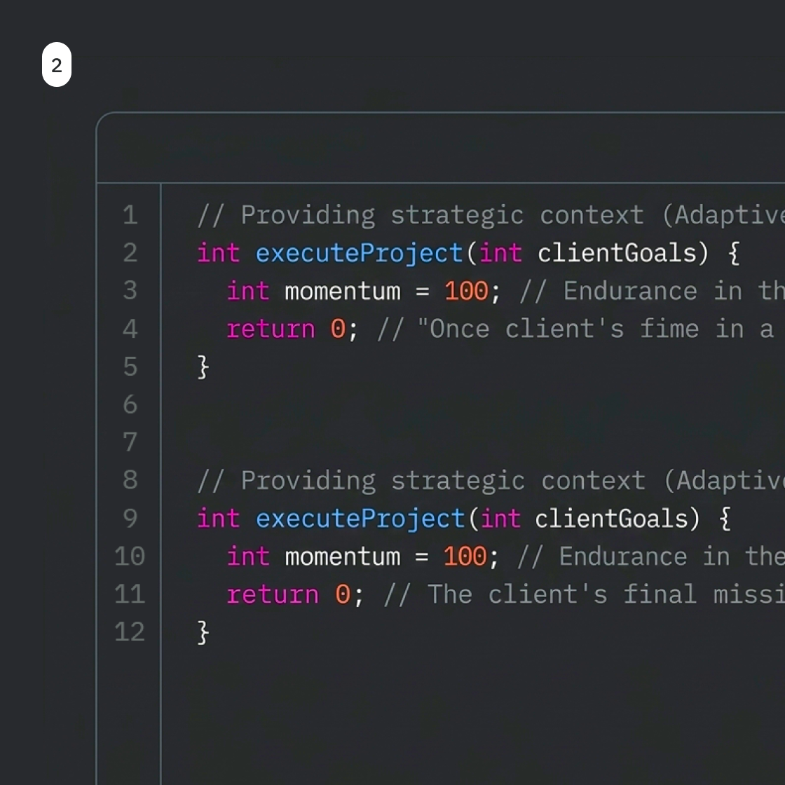
I found the definitive answer within the syntax of code. In the programming language C, the double slash // denotes a comment. These lines are completely ignored by the compiler, yet they are frequently the most critical component of the script for human operators. They provide the "Why"—the underlying strategy, systemic context, and architectural intent that prevents the entire application from failing during future engineering iterations. This is the precise execution of my role. My work—the strategic commentary—exists to ensure that the client’s core business logic executes flawlessly. While the end-user only experiences a seamless, un-commented digital product, it is this silent, foundational logic behind the scenes that makes that enterprise success repeatable and enduring.
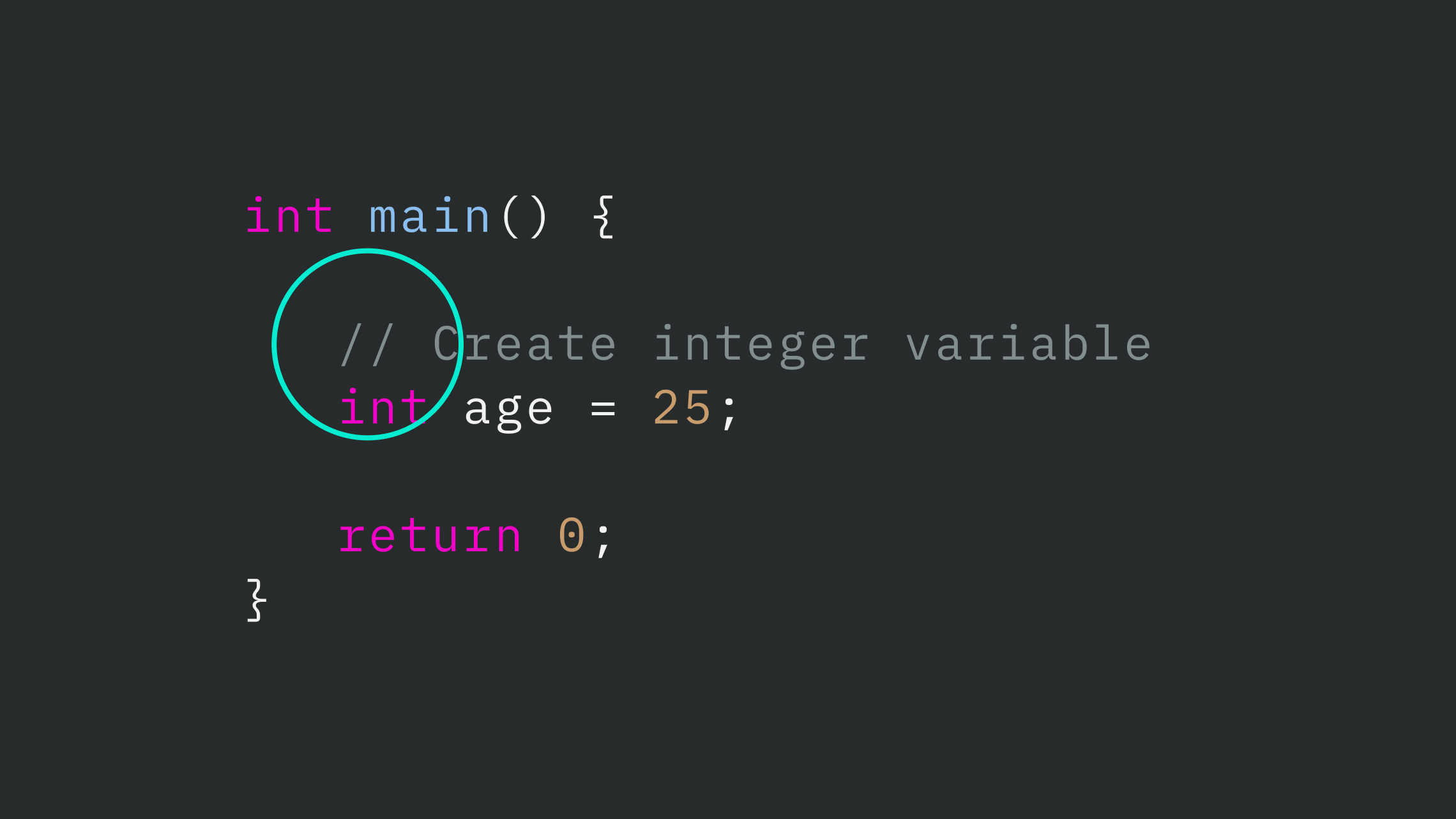
To ensure the entire brand infrastructure felt as disciplined as the complex technical ecosystems I document, I looked toward the Integrated Development Environment (IDE) for chromatic inspiration. The objective was to move beyond purely decorative brand palettes and adopt a functional syntax model, where vibrant spot colors serve as highly visible navigational and annotative tools against a stark, neutral background."
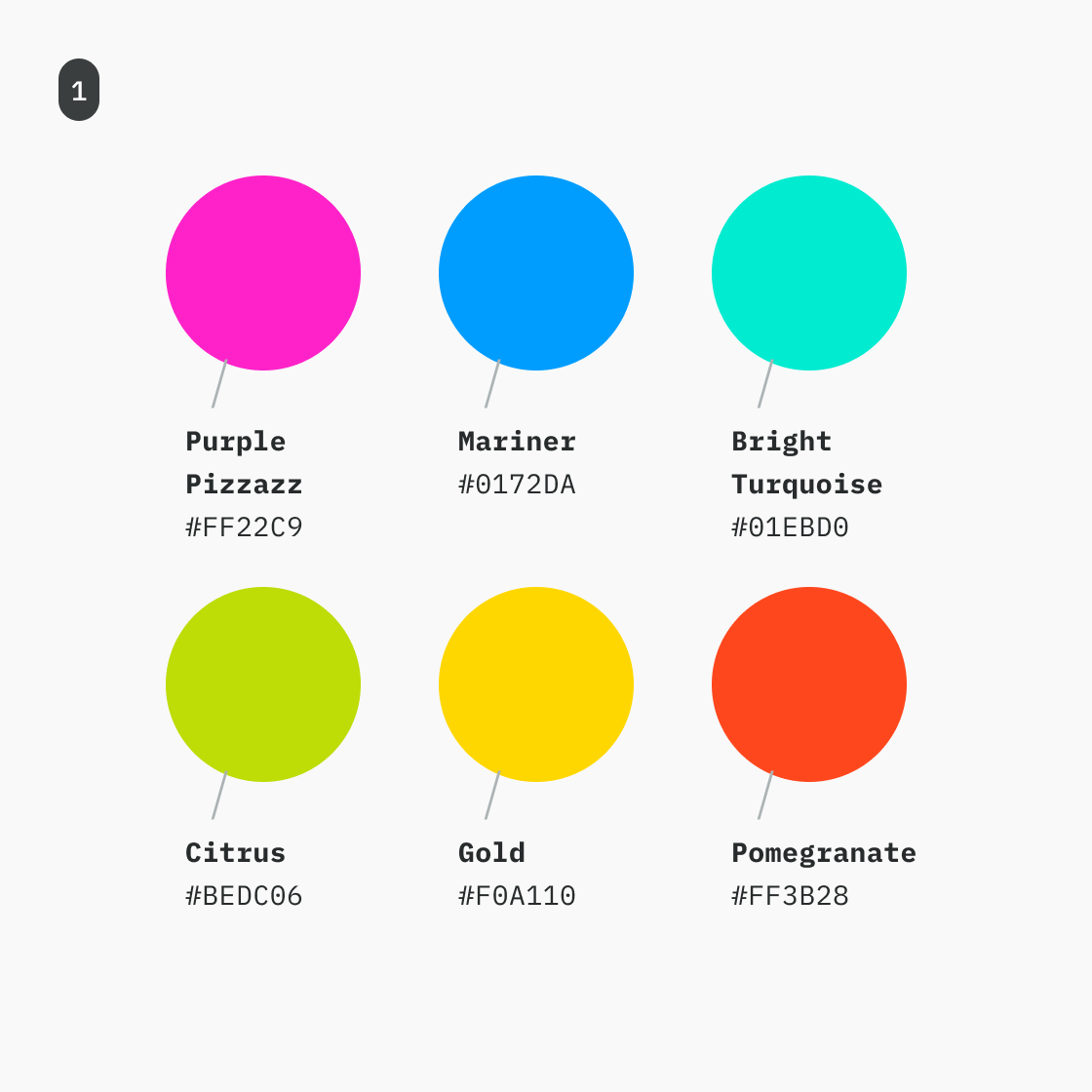
I curated a set of key spot colors (fig.1) directly from the functional visual language of modern code editors (fig.2)—specifically the high-visibility magentas, cyans, and ambers used to create immediate visual hierarchy. Rather than locking these into an overly rigid, immutable semantic code mapping at this stage, this palette was engineered to maximize functional flexibility across the entire identity. These spot colors act as dynamic "signals" within a deeper neutral environment. They provide a striking, high-contrast utility toolkit specifically optimized for drawing focus, mapping complex strategic flows, and handling technical documentation—all while contrasting the minimalist, black-and-white foundation of the broader Hagen brand.
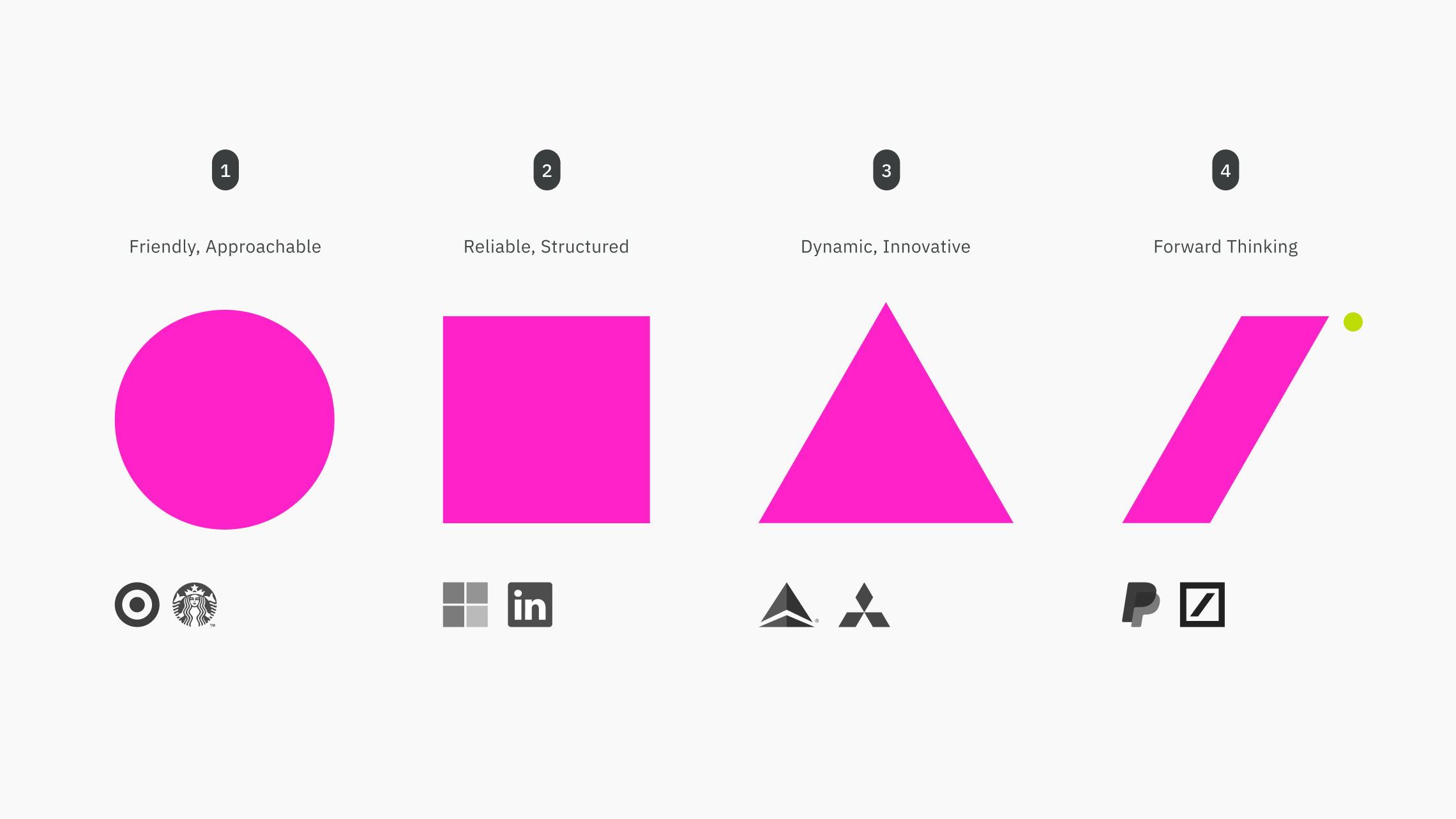
While the primary impetus for the mark is rooted in the Comment syntax of code, its effectiveness as a brand anchor is reinforced by fundamental shape psychology. The system is a synthesis of technical origin and visual impact.
In the programming landscape, the // acts as the bridge between machine logic and human explanation. It represents strategic context and purposeful disruption—the "Why" behind the "How."
The resulting matrix provides a wide spectrum of functional states—from high-contrast "Action" triggers to subtle "Background" washes. By anchoring the palette in the organized logic of the IDE, the visual language becomes inherently accessible, providing users with intuitive cues that mirror the structured environment of a code editor.
Unlike the foundational stability of a square or the inherent softness of a circle, the angled // suggests a dynamic, high-energy leadership style focused on evolution and progress.
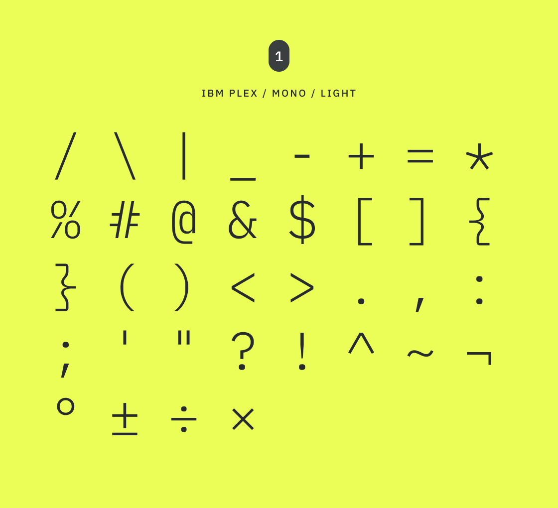
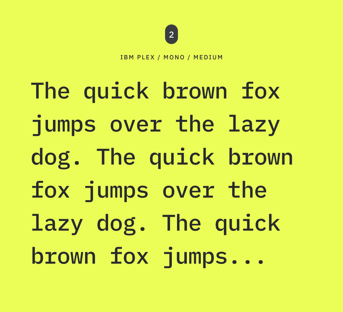
While popular developer-centric typefaces like JetBrains Mono or SF Mono provided the initial touchpoint as a nod to programming syntax, they ultimately lacked the typographic latitude I wanted for my brand. The definitive choice became the IBM Plex family. While the monospaced cut serves as the initial, high-visibility anchor for the mark, the system's true differentiator is its versatility—offering Sans and Serif variations to deploy across sophisticated, high-density layout requirements.
Originally engineered to reflect corporate precision and technical infrastructure, the typeface carries a distinct "programmed" aesthetic. The monospaced cut forms an immediate visual bridge to the C-style syntax of the primary mark. It roots the brand’s data presentation in absolute utilitarian logic, establishing a highly structured starting point for all deeper communication.
Unlike rigid, single-format development fonts, the true power of IBM Plex lies in its integrated superfamily matrix. By seamlessly incorporating high-legibility Sans and classic Serif weights alongside the technical Mono cut, the system provides the architectural flexibility to scale across high-density digital screens, complex interface states, and premium editorial layouts without ever losing its core brand identity.
In code, every character must be instantly distinct to mitigate error. This strict "zero-error" legibility criteria translates directly into thw work I do. Whether displaying high-visibility metadata in Mono or articulating complex organizational strategy in Sans, the typographic hierarchy ensures that structural context remains perfectly clear, intentional, and enduring.
To ensure the visual system felt as precise as the logic behind it, I moved into a phase of technical refinement. The goal was to harmonize the "machine-made" nature of the typeface with the bespoke "human" quality of the brand mark.
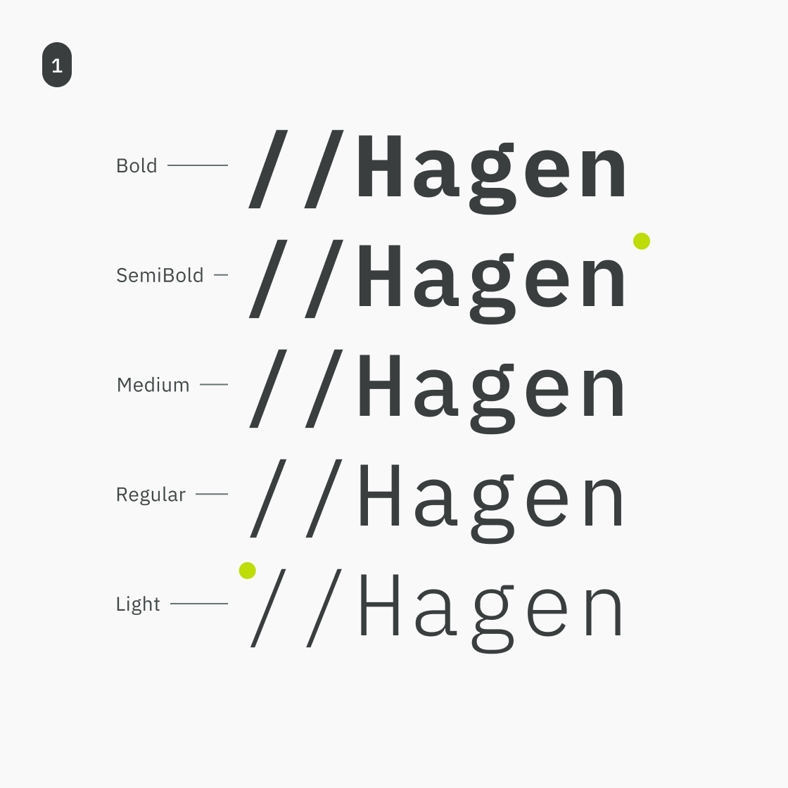
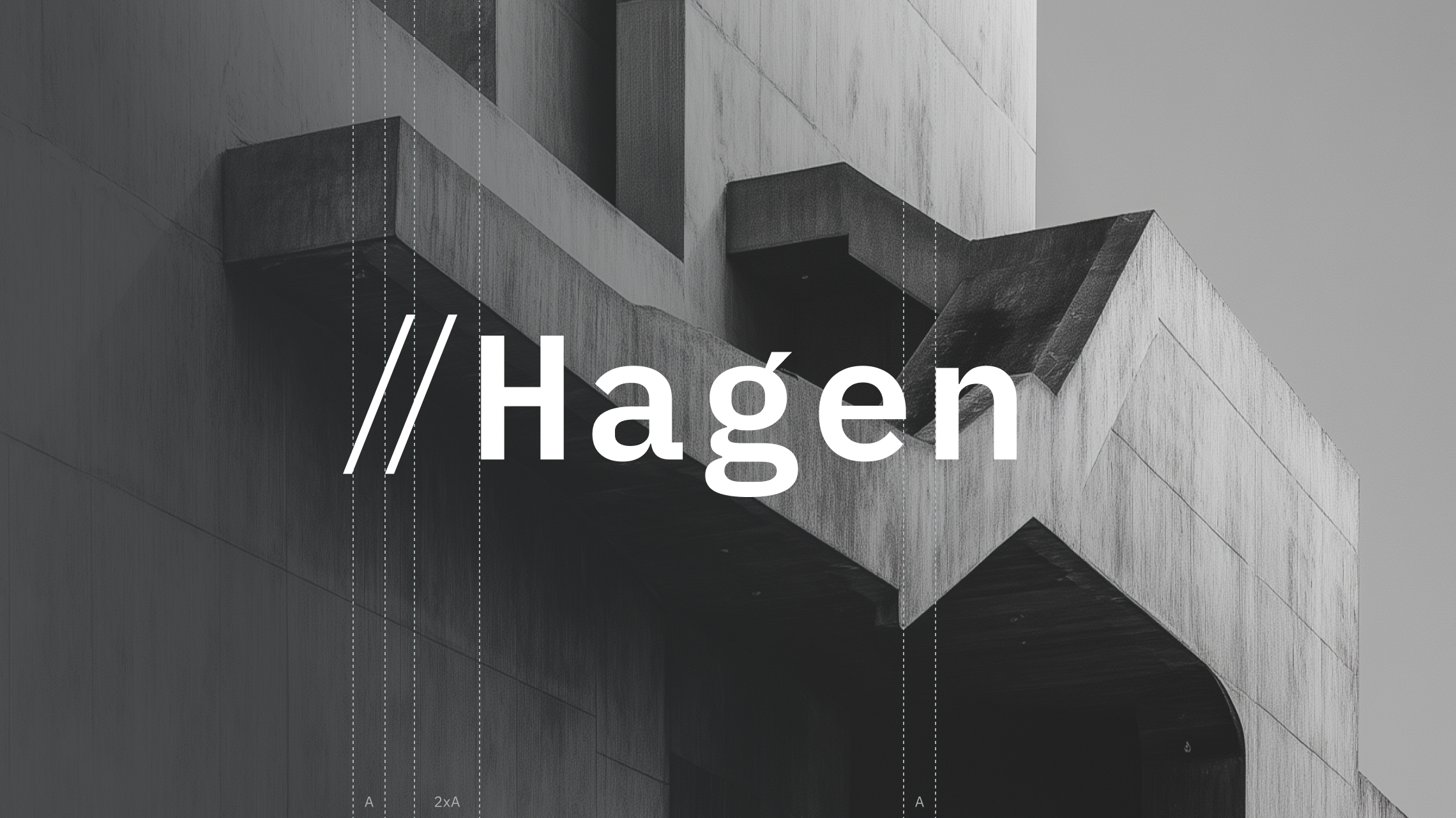
I analyzed the typographic spectrum of IBM Plex Mono to intentionally decouple the abstract mark (//) from the wordmark (Hagen). To avoid a single monolithic weight block, I selected the Light cut for the slashes to anchor it against a high-contrast SemiBold weight for the wordmark (fig.1). This specific pairing ensures both elements maintain independent optical clarity without feeling overly dense or chunky.
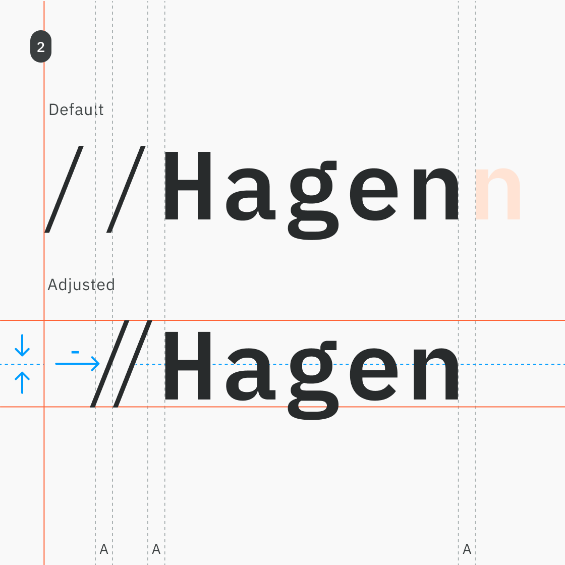
Monospaced typefaces are programmatically locked to a uniform grid where every glyph occupies the exact same horizontal footprint. While this constraint ensures strict vertical alignment in code terminals, it creates massive optical imbalance within a wordmark. To transition the typography from a functional typeface to logo, I overrode the native monospaced spacing to achieve visual balance (fig.1).
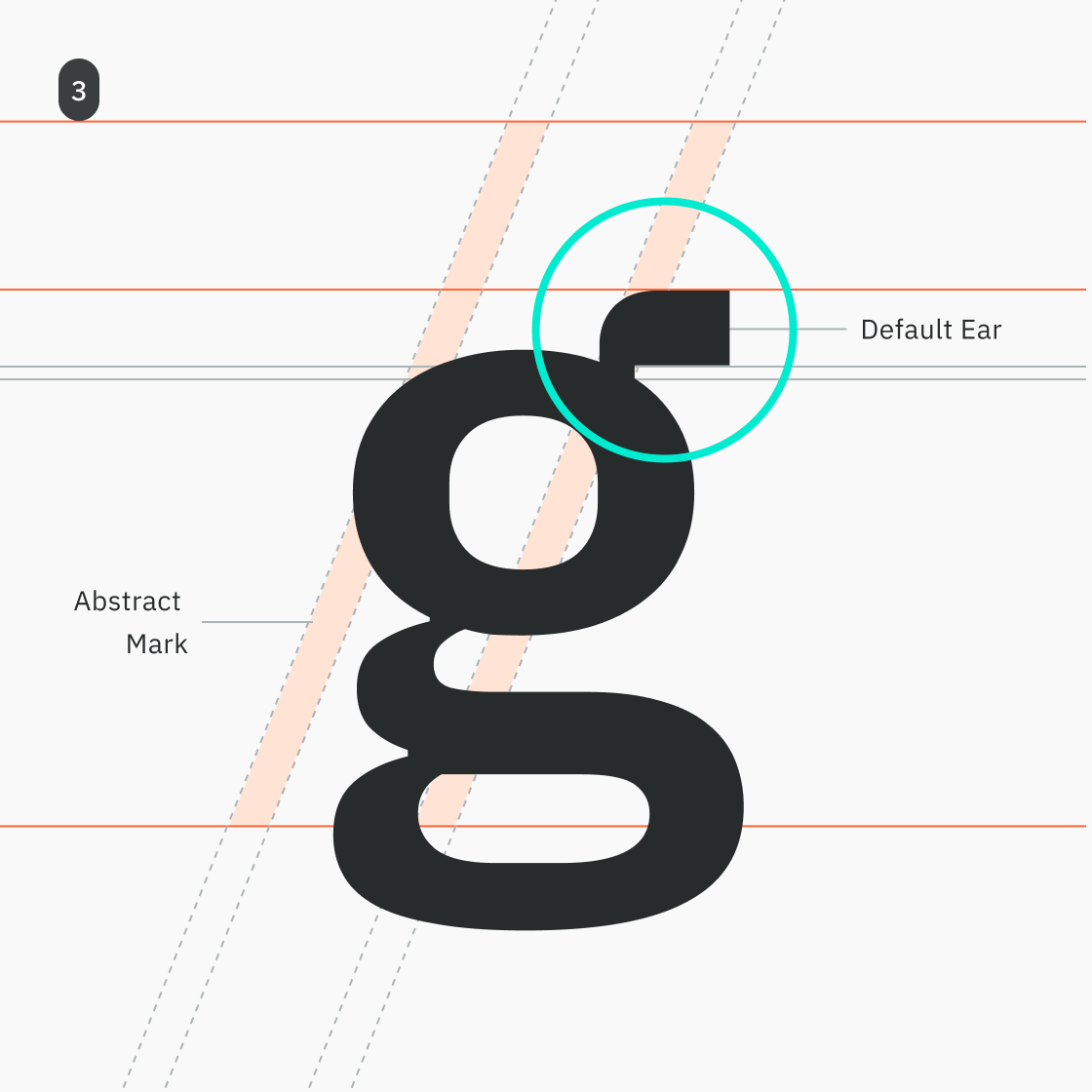
While analyzing the lowercase anatomy of IBM Plex Mono, I identified a critical disconnect: the abstract mark (//) created a distinct visual rhythm, but the wordmark (Hagen) felt like an isolated textual entity. To unify the two, I saw an opportunity to inject the kinetic energy of the syntax slashes directly into the wordmark (fig. 3) to repeate the cadence, ensuring both elements feel inherently bound to the same visual DNA.
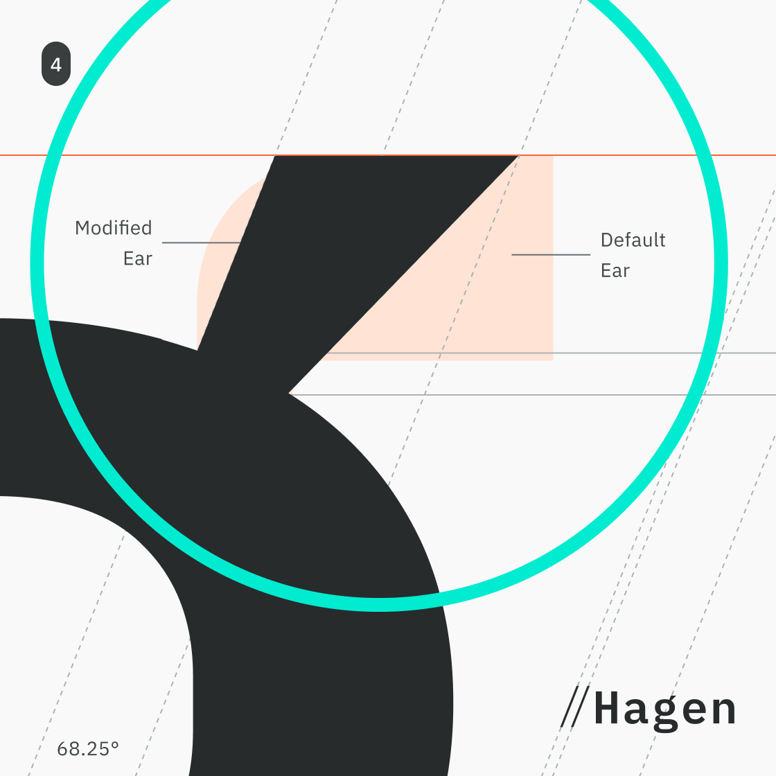
To execute this, I altered the geometry of the character's ear, modifying its termination slope to perfectly match the exact 68.25º angle of the // abstract mark (fig. 4). To ensure a seamless fluid transition rather than an unanchored visual anomaly, the geometry is precisely tapered: the root of the ear matches the Light stroke-width, while the terminal edge expands to match the SemiBold stroke-width of the slashes.
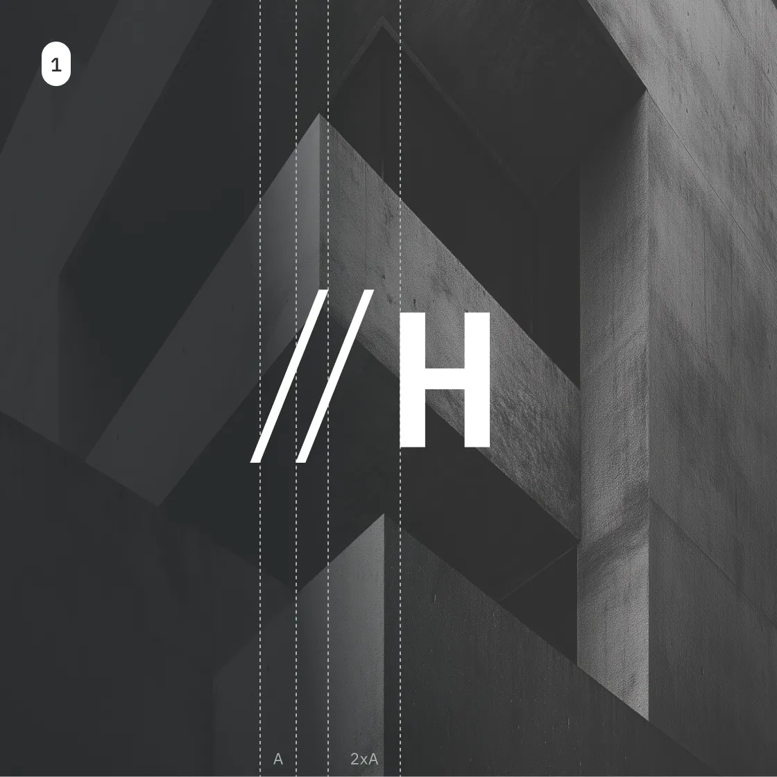
The visual identity is designed as a modular system, allowing the technical logic of the // to adapt across various scales and environments. By harmonizing the geometry of the symbol with the architecture of the letterforms, I created a mark that feels both engineered and bespoke.
The primary logotype is a combination mark consisting of an Abstract Mark // and a Wordmark Hagen. The system utilizes a weight-contrast strategy: IBM Plex Mono Light for the abstract symbol and IBM Plex Mono SemiBold for the name.
This hierarchy ensures the strategic comment remains elegant and light, while the identity itself carries the necessary authority. The width of the abstract mark is mathematically derived from the stroke widths of the font, and the lowercase g has been customized to perfectly emulate the forward-leaning angle of the slashes—creating a singular, cohesive geometry.
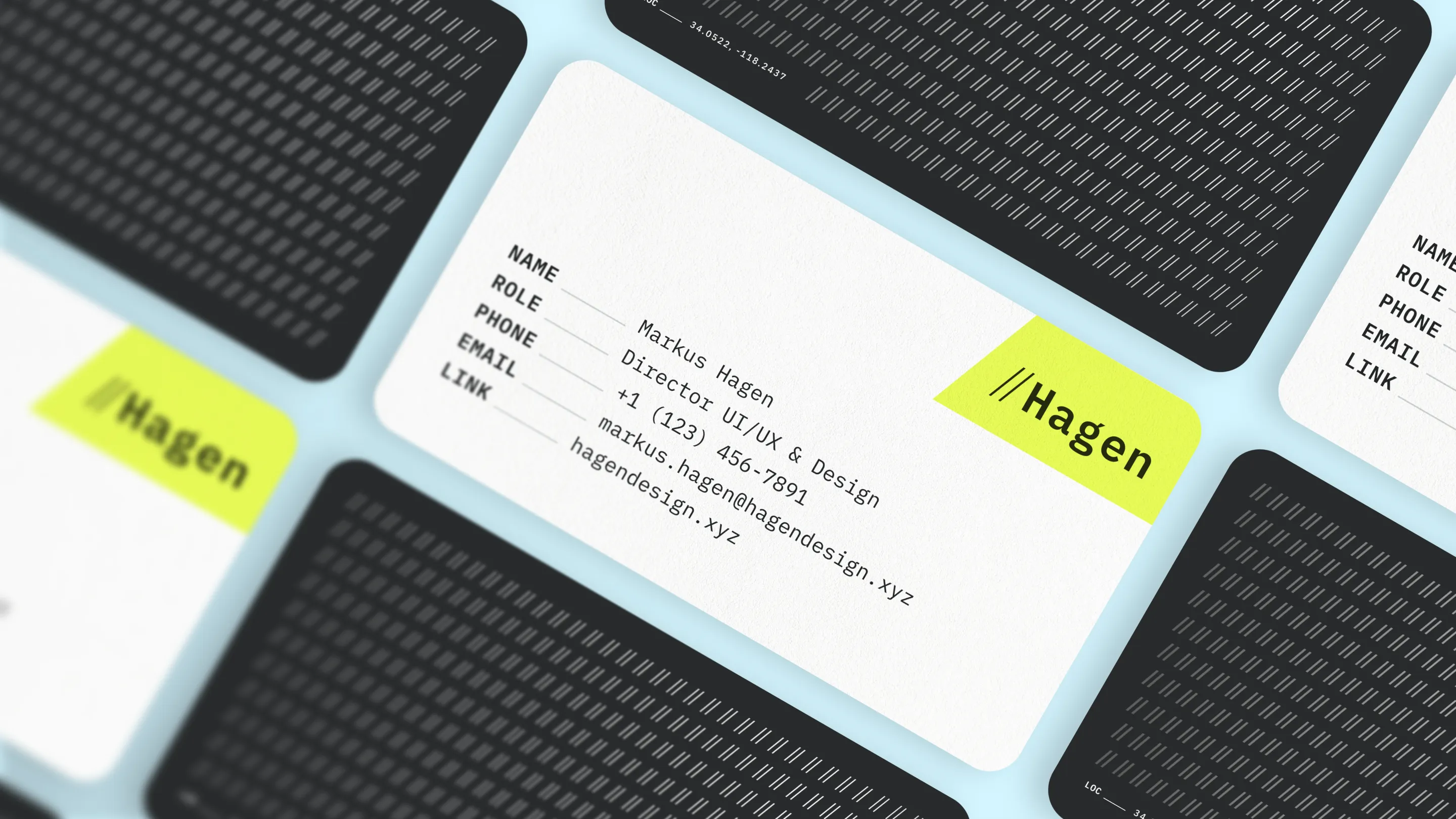
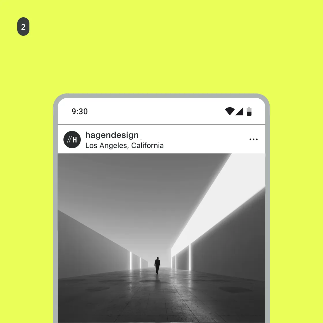
The secondary variation of the identity is a compact Combination Mark, designed for high performance in constrained environments. It pairs the Abstract Mark // with a singular Monogram H, providing a concentrated version of the brand’s visual DNA.
This variation is optimized for small-scale applications such as app icons, social media avatars, and mobile UI components (Fig 2). By reducing the brand to its most essential characters, it ensures that the "Hagen" identity remains punchy and legible where a full-length wordmark would lose impact.
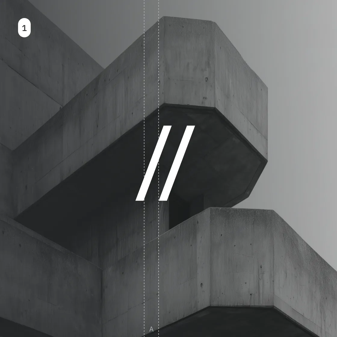
The monogram utilizes the same IBM Plex Mono SemiBold weight as the primary logotype, maintaining a consistent "visual volume." Furthermore, the spatial relationship between the // and the "H" is derived from the same "A" / "2xA" grid system (Fig 1), ensuring the secondary mark feels like an inevitable, mathematically derived extension of the primary mark.
In specialized high-density or minimal-UI scenarios, the Abstract Mark // functions independently as a standalone asset. This tertiary variation provides the brand with maximum legibility where the primary or secondary marks would lack clarity.
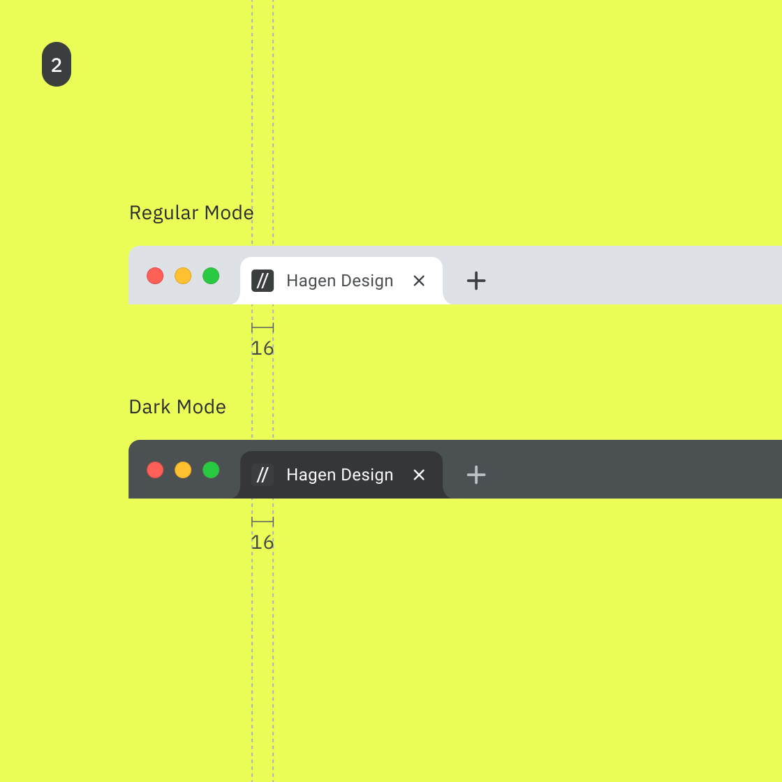
The primary driver for the tertiary mark is the browser favicon (16x16 pixels). At this scale, the monogram H within the secondary mark loses its definition. To ensure the brand remains identifiable, we strip the identity back to its most fundamental component: the // syntax.
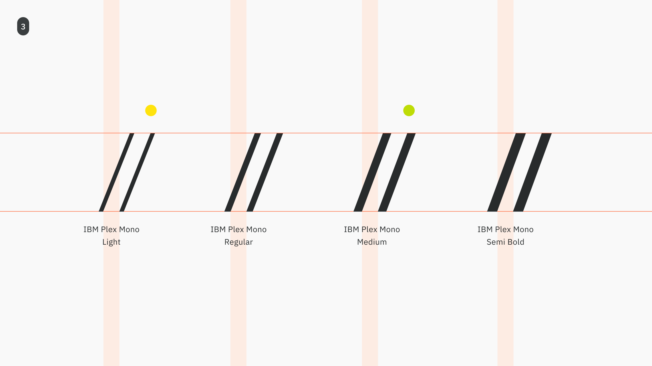
To optimize for extreme miniaturization, the tertiary mark undergoes an optical adjustment. I increased the stroke width to match the IBM Plex Mono Medium weight (Fig 3). This slight increase in "ink" ensures the mark retains its sharp geometry without bleeding into the background of a browser tab, maintaining its authority even at the smallest footprint.
With the Syntax Highlighting logic established, I expanded the core spot colors into a comprehensive, multi-dimensional system. This transition from extraction to application ensures that the brand remains visually expressive while meeting the rigorous accessibility demands of modern digital products.
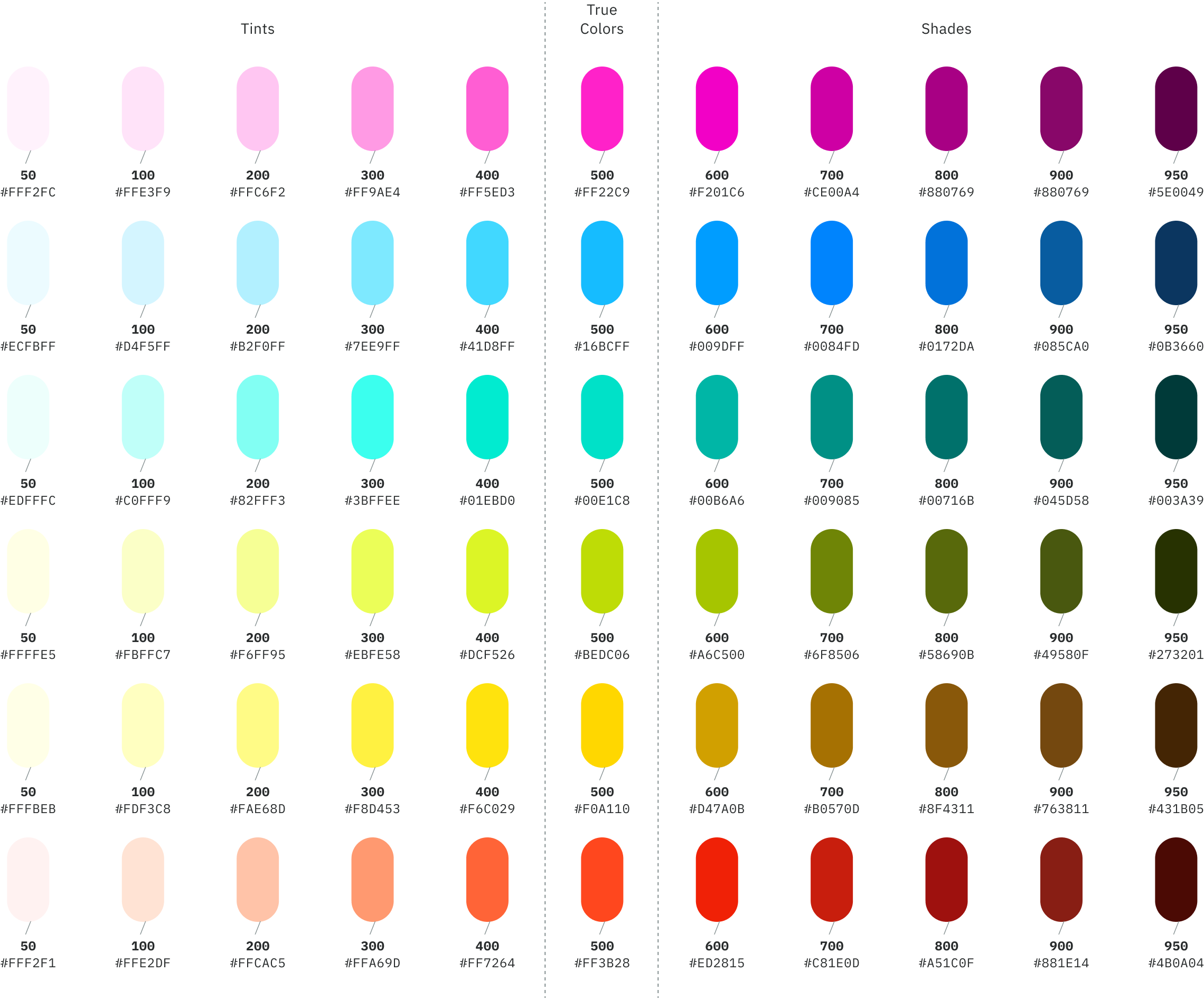
I developed these tonal ranges using a mathematical scaling model to generate precise, solid color steps (Fig 3). While many design systems rely on transparency scales, I prioritized solid hex values to ensure absolute control over contrast and legibility. This approach eliminates "contrast bleed," ensuring the system remains high-performance in complex, high-density interface scenarios.
The resulting matrix provides a wide spectrum of functional states—from high-contrast "Action" triggers to subtle "Background" washes. By anchoring the palette in the organized logic of the IDE, the visual language becomes inherently accessible, providing users with intuitive cues that mirror the structured environment of a code editor.
The photography system is designed to counterbalance the technical precision of the // mark. It moves away from generic corporate imagery toward a "Human-Architectural" perspective that feels both grounded and ambitious.
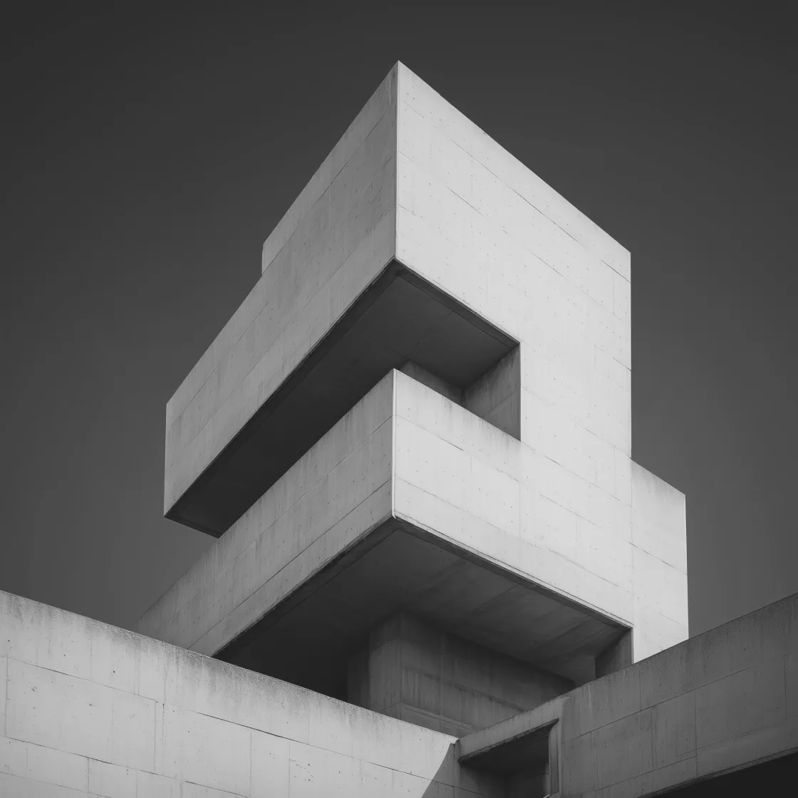
We utilize high-contrast, black-and-white architectural photography—specifically focusing on Brutalist structures. This reinforces the brand pillars of Enduring and Architectural, providing a disciplined, physical environment for the digital-first identity to inhabit.
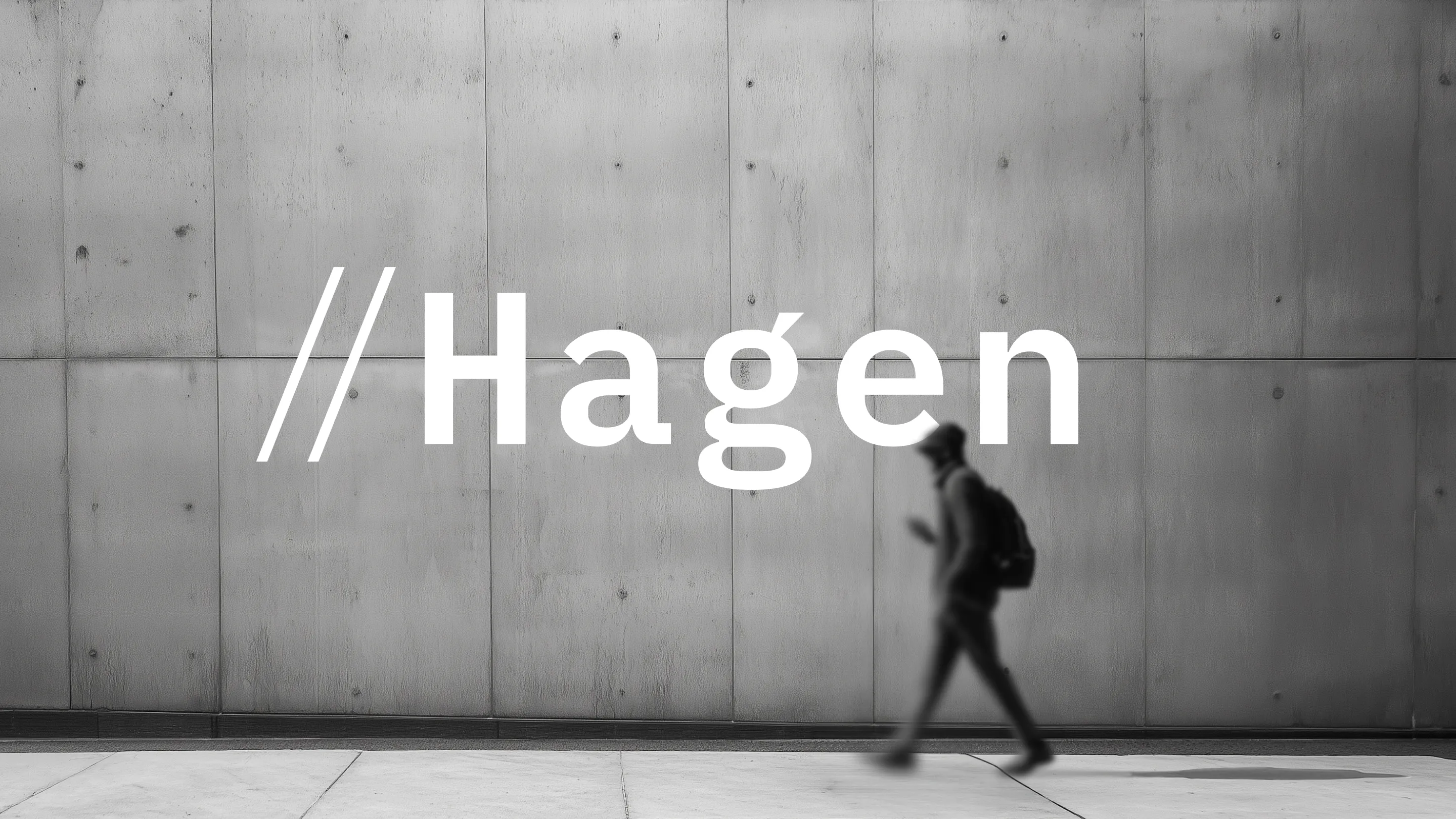
To ensure the brand remains approachable, we integrate "human-scale" moments. These shots are characterized by candid interactions, deep shadows, and a focus on process. This emphasizes the "Human-Craft" quality and the strategic "commentary" that characterizes the work.
For system documentation and hero layouts, we utilize "plate shots"—straight-on, front-elevation views of concrete grids. These serve as a structural canvas, allowing the vibrant functional syntax of the color system and typography to remain the primary focus.